
Why Great Ceramic Photos Sell — Fast
We’ll show a simple, repeatable six-step setup to create studio-quality ceramic photos without a full studio, focusing on predictable lighting, clean composition, and buyer-ready exports so our pieces look as lovely online as they feel in our hands, and sell
What We Need
Mastering Ceramic Photography with B&C Camera
Step 1 — Prepare the Piece: Clean, Repair, and Style
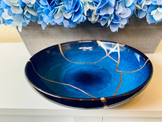
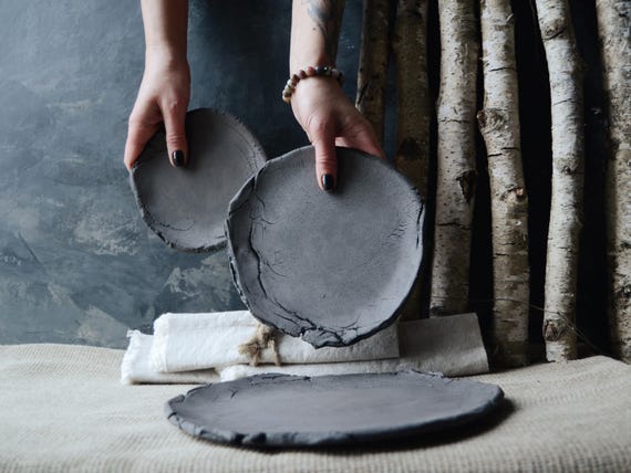
Want buyers to feel the glaze through the screen? Start with flawless pieces.Inspect each ceramic for dust, fingerprints, kiln marks, hairline cracks, and glaze flaws—we do this before any lighting or composition.
Clean gently with a soft brush and a microfiber cloth. For stubborn spots, use warm water and a drop of mild dish soap, rinse, and dry thoroughly. Fix tiny scuffs with a matching ceramic-safe touch-up or fine sanding if appropriate; we avoid major repairs that change the piece’s character. Decide whether to show the maker’s marks—sometimes they sell the story.
Style minimally. Choose complementary props that don’t compete—examples: a linen scrap, a neutral spoon, or a tiny sprig of greenery. For cups and bowls, keep shot consistency: always include a top-down and a 45° front view.
Preparing the piece upfront saves time in editing and keeps product pages uniform across our shop.
Step 2 — Set Background & Surface: Keep It Consistent
Can a backdrop increase conversions? Yes — and here’s the easiest way to pick one.Choose a background that flatters the glaze and fits our brand: white sweep for marketplaces, warm neutral for artisan shops, textured board for rustic ceramics. Start with what sells for your audience.
Use a sweep — seamless paper or foam board — to avoid distracting lines and hard edges. Keep the horizon smooth so the eye stays on the piece.
Select surfaces like wood, concrete, or matte laminate; avoid glossy surfaces that create reflections. Test small samples to see how they render color and texture.
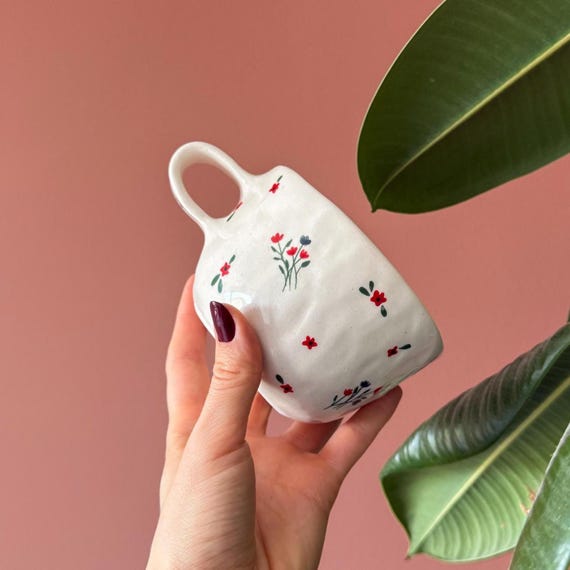
Add a lifestyle feel with one or two props only; keep negative space. For example, pair a handmade mug with a linen scrap or a wooden spoon placed off-center to tell a quick story.
Step 3 — Pick Gear & Camera Settings: Sharpness Over Everything
Do we need a DSLR? Not necessarily — but here’s how to get pro results whether it’s a phone or a camera.Choose a 50–100mm equivalent lens on a camera to avoid distortion; try a 90mm for a small cup to compress perspective. Use the phone’s primary lens and apply portrait mode carefully — avoid aggressive smoothing.
Set core exposure basics and shoot reliably:
Shoot in RAW for maximum editing flexibility. Tether or preview on a larger screen when possible to confirm sharpness and composition. Set white balance manually or plan to correct in RAW; include a gray card in your first frames to create an accurate profile and speed color correction.
Step 4 — Compose, Stabilize, and Add Scale
No shaky, ambiguous shots — just clear, compelling images that answer buyer questions at a glance.Mount the camera on a tripod and use a remote or the timer to eliminate shake; we want pixel-perfect sharpness.
Compose deliberately.
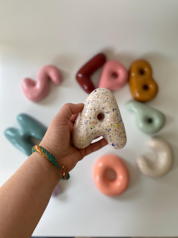
Include a scale reference—a hand, teaspoon, or ruler—placed naturally so buyers instantly understand size.
Apply the rule of thirds to add interest, but keep the product centered for tight thumbnails and gallery consistency.
Tilt the piece slightly (10–20°) to reveal texture, glaze depth, or interior curves; for example, we shoot a shallow bowl top-down, then tilt 30° to show glaze pooling.
Take multiple variations (wide, detail, scale) so we can choose the strongest storytelling sequence later.
Step 5 — Light for Texture and True Color
Want glaze depth that jumps off the screen? Control your light — it’s the single biggest conversion booster.Use soft, directional light to reveal texture without harsh hotspots. Place a large softbox or put the piece near a window with a diffuser to create gentle wrap‑around light.
Add a reflector opposite to lift shadow detail and keep shadow edges soft. Angle a side or backlight low to accentuate surface relief—this makes crackle glazes and carved marks pop.
Check small changes in light angle—move the source 10–20° and reshoot; often a tiny tweak transforms perceived glaze and form.
Step 6 — Edit, Export, and Prepare Listings
Final polish wins sales: should we trust presets? Yes — but customize for each piece.Edit images in batches for consistency. We start in RAW: adjust exposure, contrast, and white balance, then sync settings across the set so every shot reads the same.
Ready to Shoot Sale-Ready Ceramics
With this six-step setup we create repeatable, professional images that convey feel, scale, and finish; we practice the routine and refine lighting and editing to maintain a consistent shop aesthetic. Ready to elevate every listing with predictable, beautiful sale-ready photos?


Really clear on camera settings — thanks. I usually shoot on a mirrorless with a 50mm 1.8. The guide’s “sharpness over everything” is a great mantra, but could use a quick table of recommended apertures for different piece sizes (e.g., small ring dishes vs. large pitchers).
Also: RAW vs JPEG debate — you sort of hinted at RAW, but can you recommend compression/bit depth and export settings for big marketplaces? I’m always paranoid about file size limits.
Good suggestions, Nina. Quick rule of thumb: small pieces (under 10 cm) aperture f/5.6–f/8; medium (10–25 cm) f/8–f/11; large (25+ cm) f/11–f/16 for edge-to-edge sharpness (depends on lens).
RAW is best for capture. For marketplaces: export high-quality JPEGs (sRGB, 8-bit) with max dimensions they allow — typically 2000–3000 px on the long edge and quality 80–90. If they support it, upload uncompressed PNGs for flat-color items, but JPEG is usually fine.
Really helpful aperture guide — I’ve been shooting my teapots at f/4 and regretting the soft rims.
Perfect, that aperture guide is gold. Thanks!
Love the “add scale” line. Every listing should have a banana for scale. Or is that too ecomm-meme? 😅
On a serious note: I tried adding a small ruler and a stacked book behind the piece. Which one do you think gives a better sense of size without stealing the spotlight?
Haha banana is classic. Ruler is objective but not very aesthetic; stacked books can work if styled to match the shot. Another good option: a small, neutral prop (like a wooden spoon or coin) placed off-center so it doesn’t dominate but still communicates scale.
I use a neutral ceramic saucer from the same maker — blends in and still shows size. People seem to like seeing it paired with another handmade object.
Hey folks — total beginner here. Bought a secondhand DSLR and a cheap softbox. Should I invest in a macro lens or just use a kit lens and crop? My pieces are small (tiny bud vases). Also, any advice on surfaces — do I need real wood or is vinyl fake-wood okay?
I started with a kit lens and then rented a 60mm macro for a week — total gamechanger for detail shots. Worth renting first to test.
Welcome, Ethan! For tiny pieces, a macro lens makes life a lot easier because you can focus close and keep edges sharp. That said, a good kit lens and careful cropping can work if you keep distance and use a tripod.
For surfaces: high-quality vinyl or printed backdrops can be excellent and consistent. Real wood looks great but can vary; if you want consistency across listings, choose one material and stick with it.
Local camera shops often rent out lenses cheaper than big chains. Check them first.
Thanks! Renting a macro sounds smart. Any recommended rental sites?
Loved the editing/export section — super practical. Short note: when you said “prepare listings,” could you expand on naming conventions for files? I use IMG_123.jpg and it’s a mess when bulk uploading.
Also wanted to say the “Ready to Shoot Sale-Ready Ceramics” checklist at the end sealed the deal for me — printed it and stuck it on the wall.
Perfect, I’ll rename my files tonight. Thanks!
Glad the checklist helped, Sophie! For filenames we recommend: makername_product_shortdesc_angle_size.jpg (e.g., “blueleaf_mocha_cup_front_85mm.jpg”) — keep lowercase, underscores, and no special characters. That makes batch uploads and SEO easier.
Also consider including SKU or listing ID if you relist often.
Really useful section on lighting. Quick question: for Step 5 — “Light for Texture and True Color” — how close should the softbox be? The guide says “soft light”, but my setup is a tiny studio so I worry about blowouts.
Also, are color-check cards necessary for every shoot? I sell colorful mugs and I want the online photos to match reality as much as possible.
2-3 feet is doable. Also trust your eyes but confirm in RAW — my phone fooled me once 😂
Awesome — thanks! I’ll try the histogram tip. Never thought to check that during a shoot.
Great questions. For a small softbox, start about 2-3 feet from the subject and move it closer if you want softer transitions; further away gives more contrast. Check your histogram to avoid clipping highlights.
Color-check cards are best for consistent color — if you edit in batches or use presets, include the card in one test shot per session. For single item shoots, a calibrated monitor + RAW files can be enough, but cards make life easier.
Nice walkthrough overall but I had a couple of issues — the “Keep It Consistent” background advice is spot-on, yet the examples felt very white-minimal and not practical for darker/oxidized glazes.
I run a small studio that leans toward earthy, textured surfaces. Any tips for keeping consistency with non-white backgrounds? I tried the guide’s blanket settings and ended up with muddy shadows.
Also: can we talk about editing — the guide mentions exporting but not how to batch-correct slight white balance shifts across a set of 12 items.
I switched to gray backgrounds last year and my listings look 100x better. No muddy shadows now.
One more tip: if you can’t use a color card in every shot, include it in one photo per batch and use that to create a custom camera calibration/profile — gives better baseline than WB adjustments alone.
I shoot on a mid-gray muslin and it’s way easier to keep consistent than trying to force black backdrops. Also try using a single light modifier and keep its position fixed for the whole session.
Thanks — gray muslin sounds promising. I’ll try the preset workflow. Appreciate the quick help!
Thanks for the feedback, Olivia — great point. For earthy, textured backgrounds, try using a neutral gray or mid-tone background rather than very dark or black; it keeps highlights controlled and makes color grading easier.
For batch white-balance: do one correct reference image with a color card, create a preset in Lightroom (or a profile in Capture One), and apply it to the rest. Then fine-tune exposure per image. That minimizes shifts.
Great guide — thanks! I especially loved the bit about “Sharpness Over Everything.” Came here trying to get my pots to look less handmade and more shop-ready.
I do have one workflow Q: after cleaning and styling (Step 1), do you recommend shooting every angle first and then doing detail shots, or mix them? I tend to forget to shoot the bottom markings until I’m editing 😂
Also, small tip that worked for me: use a piece of white paper to bounce light into deep glazes so you don’t lose texture. Saved a bunch of shots for my last listing.
Yep, forgot bottoms once and had to relist. Nightmare. Pro tip: put a sticky note on your camera or tripod saying “bottom” until it becomes habit.
Thanks Daniel — glad it helped! We usually recommend a two-pass approach: 1) the standard set of angles (front, side, 45°, top) to get consistent product images, then 2) close-ups and detail shots (glaze texture, maker marks, chips). That way you don’t miss bottoms or signatures. The white paper bounce tip is excellent — simple and effective!
Two-pass is what I do too. Also, label shots in-camera (e.g., IMG_001_front) if your camera app supports it — saves time later.
Short and sweet — this guide fixed my focus issues. Using a tripod + live view was the game changer. 🙌
Same here. Live view plus 5x magnification on the camera made tiny chips obvious before I shot.
Love hearing that, Jon! Tripod + live view reduces missed focus, especially with shallow DOF on bowls and vases.